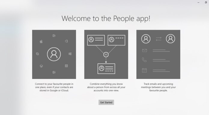
Last year, Microsoft first brought Fluent Design to the People app. However, the company also kept the older UI design in place, most notably the hamburger menu. With the latest Insider release, Microsoft has now removed the hamburger menu in the app. The hamburger menu is a previous Windows 10 design element that was essentially a side bar on applications. It is possible the menu will return to the Windows 10 People app with further Fluent Design changes. Some other UI tweaks have been made, including improvements to the back button in People. Additionally, the application now works more seamlessly with the upcoming Windows 10 Sets feature. If you are unfamiliar with Sets, it is a tabbing system that will work across Windows 10. Essentially a universal tab ability for applications. It works like tabs on a web browser, allowing users to open a tab in an application by clicking a + symbol in the title bar. A new tab will show recent apps, documents, and a search. There is still speculation about the eventual release of Sets. The much-anticipated feature has been delayed several times since last year and was widely expected to launch with Redstone 5. However, we reported last month Microsoft is considering delaying the feature again.
Availability
While Microsoft has removed the hamburger menu, other general Fluent Design elements remain in Windows 10 People. It is worth noting the Universal Windows Platform (UWP) app is available on mobile and desktop, but only the PC version is receiving this update.


